Xaml DataGrid custom column style
Autor: Libor Bešenyi
Dátum: 8.2.2014
Sometimes we need to customize data grid style. Just little changes can make application more user friendly (or data more readable). I don’t like to customize rows. We used to customize columns (changed color for different column types and right aligment for numbers / dates).
There is not much information about it on the Internet, so I will try to explain some basic XAML features for working with whole columns. You can find here very basic information. For more complex styling you can use for example this article:
http://www.codeproject.com/Articles/72732/Silverlight-Glass-DataGrid-Header-Styles
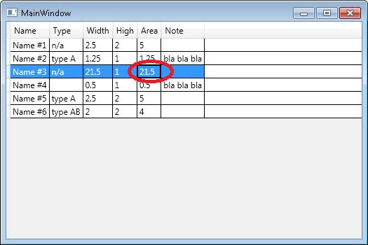
On the screen above we can see standard WPF DataGrid. There is allowed selection of row and cell. If we want to turn-off cell selection, we can change border of the cell to zero:
<Application.Resources>
<!-- DataGrid -->
<Style TargetType="{DataGridCell}">
<Setter Property="BorderThickness" Value="0"/>
</Style>
</Application.Resources>
For column alightment we need to create new colum style:
<Style x:Key="DataGridNumberCellStyle" TargetType="DataGridCell">
<Setter Property="TextBlock.TextAlignment" Value="Right" />
</Style>
This style we can link with our column in the datagrid column definition. Columns not defined this style will be rendered by default way (as previously):
<DataGrid.Columns>
<DataGridTextColumn Header="Name" Binding="{Binding Name}" />
...
<DataGridTextColumn Header="Width" Binding="{Binding Width}"
CellStyle="{DynamicResource DataGridNumberCellStyle}" />
...
</DataGrid.Columns>
Result we can see below:
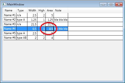
As we can see, there is again problem with cell selection. This rule was overlap with new column definition. We can setup same border to new cell, but I would prefere inherit original settings and just changing new format requirements. If we want to inherit original data, we will need change our style definition using BasedOn parameter:
<Style x:Key="DataGridNumberCellStyle" TargetType="DataGridCell" BasedOn="{StaticResource {x:Type DataGridCell}}">
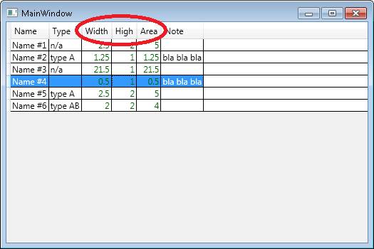
If we wanted to change text color, we could add simply new rule to existing style:
<Style x:Key="DataGridNumberCellStyle" ...>
...
<Setter Property="Foreground" Value="DarkGreen" />
</Style>
There is not little conflict between grid’s content and header:
We can change also header style to keep it consistent with content. It will be very similar like we added styles for the columns. At first we need to create header style:
<Style x:Key="DataGridNumberHeaderStyle" TargetType="DataGridColumnHeader">
<Setter Property="HorizontalContentAlignment" Value="Right" />
<Setter Property="Foreground" Value="DarkGreen" />
</Style>
Which can be linked with colum by this way:
<DataGridTextColumn Header="Area" Binding="{Binding Area}"
CellStyle="{DynamicResource DataGridNumberCellStyle}"
HeaderStyle="{DynamicResource DataGridNumberHeaderStyle}" />
What about selection row?
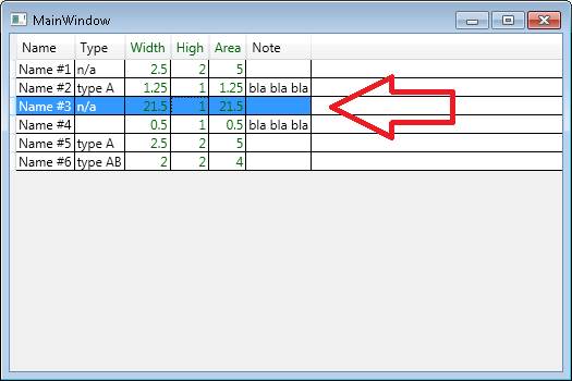
We can also change for example background color. We will add new rule to existing cell style. This will be triggered value. Triggers are linked to GUI controller so can be managed based on events raised from the control. We would like to handle IsSelected event and overwrite original blue color to green:
<Style TargetType="{DataGridCell}">
...
<Style.Triggers>
<Trigger Property="IsSelected" Value="True">
<Setter Property="Background" Value="DarkGreen" />
</Trigger>
</Style.Triggers>
</Style>

There is something wrong. Our background color and column text color is in the conflict. So we need to overlap column text color in selection mode back to original white. For example with adding new style:
<Trigger Property="IsSelected" Value="True">
...
<Setter Property="Foreground" Value="White" />
</Trigger>
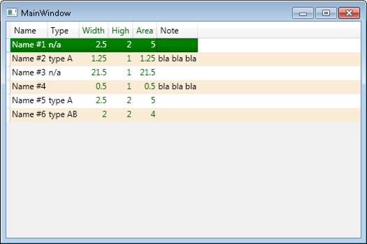
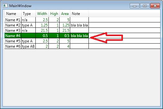
In the WPF we can do more complex things. For example we can add „shadow effect“ to the bottom of our selection. This is achievable for example with gradiend background, where we change static color and we link new resource defined gradient rules:
<Trigger Property="IsSelected" Value="True">
<Setter Property="Background" Value="{DynamicResource RowBackgroundSelectedBrush}" />
...
</Trigger>
<LinearGradientBrush x:Key="RowBackgroundSelectedBrush" StartPoint="0,0" EndPoint="0,1">
<GradientStop Color="Green" Offset="0" />
<GradientStop Color="Green" Offset="0.55" />
<GradientStop Color="DarkGreen" Offset="1" />
</LinearGradientBrush>
We can also hide inner grid line and setting up alternative row colum:
<Style TargetType="DataGrid">
<Setter Property="RowHeight" Value="20" />
<Setter Property="GridLinesVisibility" Value="None" />
<Setter Property="AlternationCount" Value="2" />
</Style>
<Style TargetType="{DataGridRow}">
<Style.Triggers>
<Trigger Property="AlternationIndex" Value="1" >
<Setter Property="Background" Value="AntiqueWhite" />
</Trigger>
</Style.Triggers>
</Style>
Final grid is: